As much as any San Francisco neighborhood, North Beach has always been associated with the arts. It’s hardly a surprise: our picturesque streets, café culture and European vibe all hold a strong appeal for creative types. As a consequence, our stores, coffeeshops and taverns have always been leavened with plenty of gallery and music spaces. From the Beat poets to the jazz giants that used to ignite the clubs on Broadway, our sidewalks have always been crowded with inspiration. Art is inextricably woven into North Beach’s history.
That being said, when Oakland native Andrew England opened Real Old Paper Gallery in November of 2016, he landed in a fortuitous spot. And the residents of North Beach got lucky too: few spaces in North Beach combine art and history as well as England’s gallery, his first. Built around his remarkable collection of vintage posters, the gallery inhabits a unique light-filled space at the crux of Columbus Avenue and Mason Street.
As I walk up to the entrance for our interview, a cable car full of bright-eyed travelers cruises noisily by, just a few steps from the gallery’s front windows. A nice touch, to say the least.
Once inside, I’m surrounded by one of the broadest antique poster collections I’ve seen in years. Painstakingly preserved and carefully presented, the collection is complimented by a prominent wall devoted specifically to local artists, and somehow England makes the whole thing work. The space is vibrant and inviting, and feels as much like a modern museum as it does a gallery.
England was kind enough to give me an impromptu tour, and our conversation is below.
Joe Content: OK, where do we begin?
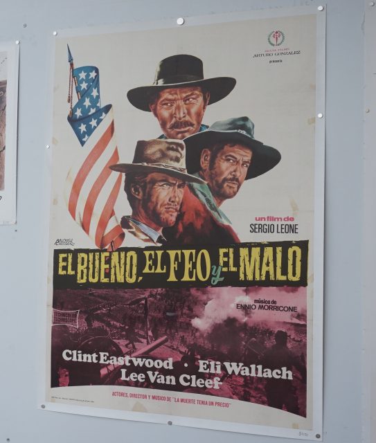
Andrew England: We’ll start right by the window. Here we have the 1968 original release poster from Spain of The Good, The Bad and The Ugly. Actually the good, the ugly and the bad, the way it reads.

Spanish poster for ‘The Good, The Bad And The Ugly.’ | Photo: Joe Bonadio
El Bueno, El Feo et El Malo.
Yes, sir. You can see it has been folded for distribution, and it has little tape stains from whoever collected it before I got my hands on it. Also, you see little bits of restoration in the centerfolds. The photo that’s featured depicts the Civil War battle scene in which the characters are trying to get over the bridge. And of course, you have Clint Eastwood, Eli Wallach and Lee Van Cleef.
What would you say about the style of this piece?
Stylistically, it’s not very unique. Only in one sense, that it combines a photograph with a graphic. That being said, it’s a feature piece, because people are going to stop and look at it.
You do have it perched pretty close to the window.
Yes, pieces like this are crucial when it comes to catching people’s eyes.
OK, here is another one I recognize.
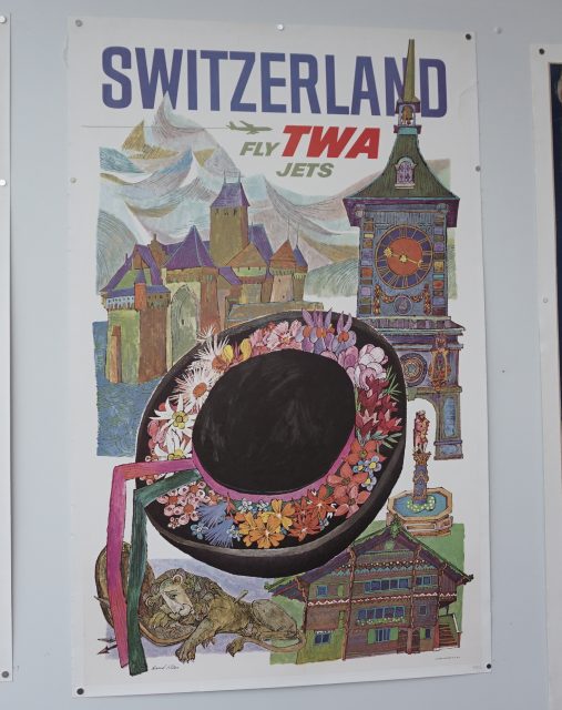
Yes, TWA. This one is from Switzerland, and it was done by David Klein, who did a lot of work for TWA during the Fifties and Sixties. This was printed during the late 1950s, and I can tell that by the logo they were using at the time. Also, because the verbiage points out that they were flying jets. During the transition from prop planes to jets, it was a big deal to say you had switched to jet planes. So that makes it easier to place the piece in time.

TWA poster from the 50s, created by David Klein. | Photo: Joe Bonadio
Klein created some of the most iconic travel posters ever for TWA. Here, he incorporated touches like famous Swiss architecture and the traditional hats from different regions of Switzerland. It’s definitely mid-century in style, sort of getting into the Sixties coloration a bit, but because it’s still the 1950s it’s not quite there yet.
The design is very playful.
Yeah, the Fifties and Sixties were a very happy time. World War Two was over, people were actually doing really well. Lots of people were traveling. Switzerland actually did quite well after World War Two.
What about this piece?
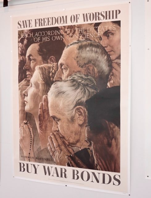
Freedom of Worship, Norman Rockwell. This one is from 1943, so it’s 74 years old. Rockwell’s inspiration for this piece was FDR’s “four freedoms” speech, about the freedoms that people all over the world should have the privilege to enjoy: freedom of worship, freedom of speech, freedom from fear, and freedom from want. And those were the four paintings that Rockwell did. They were first printed for the Saturday Evening Post, and later the Office of War Information began printing them as war bonds posters.

Vintage poster of Norman Rockwell’s ‘Freedom of Worship,’ one of the most well-known paintings of its era. | Photo: Joe Bonadio
This one is particularly cool, because in the 40s it would have been acceptable to just show American Christianity, but Rockwell decided to leave some ambiguity. You can see a holy book, you can see some prayer beads, but you don’t know if it’s a torah or a bible. He also used different age groups and different ethnicities, seemingly much more diplomatic than he had to be at the time.
OK, let’s take a look at this one. Tell me about Prunelle Du Velay.
Prunelle is a prune-based wine from the town of Velay. This piece is by Jarville, and it’s from 1922, so you are looking at 95-year-old paper. It’s the French standard size for street display, 5’ x 4’, because it was intended to be used outside. It would have been on the side of a building, or maybe in the Metro or on a billboard. It was only meant to last for a few weeks, and then it would have been thrown away.

Prunelle Du Velay by Jarville. | Photo: Joe Bonadio
It’s a stone lithograph, which means everything you see was hand-etched individually into Bavarian limestone. So with this many colors, there were probably five or six stones of that size used, weighing hundreds of pounds each; the paper was hand-pulled under each stone.
And these were meant to last just a few days.
Yeah. They would have taken hundred of hours just to etch. Then when they were done with those stone plates, they would buff them smooth and get started on the next project. They didn’t save the plates.
So these were only done in France, correct?
Well, the method of stone lithography actually comes from Germany. But the first people to put it to use in advertising were the French. That’s why poster art at its origins is French. Nine out of ten of these were done in Paris; there are a number of huge printing studios across Paris.

Real Old Paper’s Andrew England. | Photo: Joe Bonadio
How many of these would they print at a time?
Probably a couple thousand, 2,500. You know, they still do this! And they still use the same standard sizes that they did back in 1922.
Why fix it, I suppose? I have to say, there is a lot of history behind these pieces.
There really is. That’s why I wanted to do the tours, because as cool as the posters are, you can appreciate them even more if you have a little of the background.
Real Old Paper Gallery
801 Columbus Avenue
(415) 527-8333
.
Real Old Paper Gallery is open from Noon to 6:00pm, every Tuesday through Saturday. Andrew offers 30-minute private tours for $65 (maximum five per group) between 3:00 and 5:00 pm. To reserve, contact the gallery for availability: realoldpapergallery@gmail.com